Annelie Berner
Projects
Courses
Talks & Workshops
Annelie Berner —
Annelie Berner is a
designer, researcher, teacher and artist specialised in data
visualisation.

The visualizations are prospective and representative of concepts to be explored. We've focused on two areas:
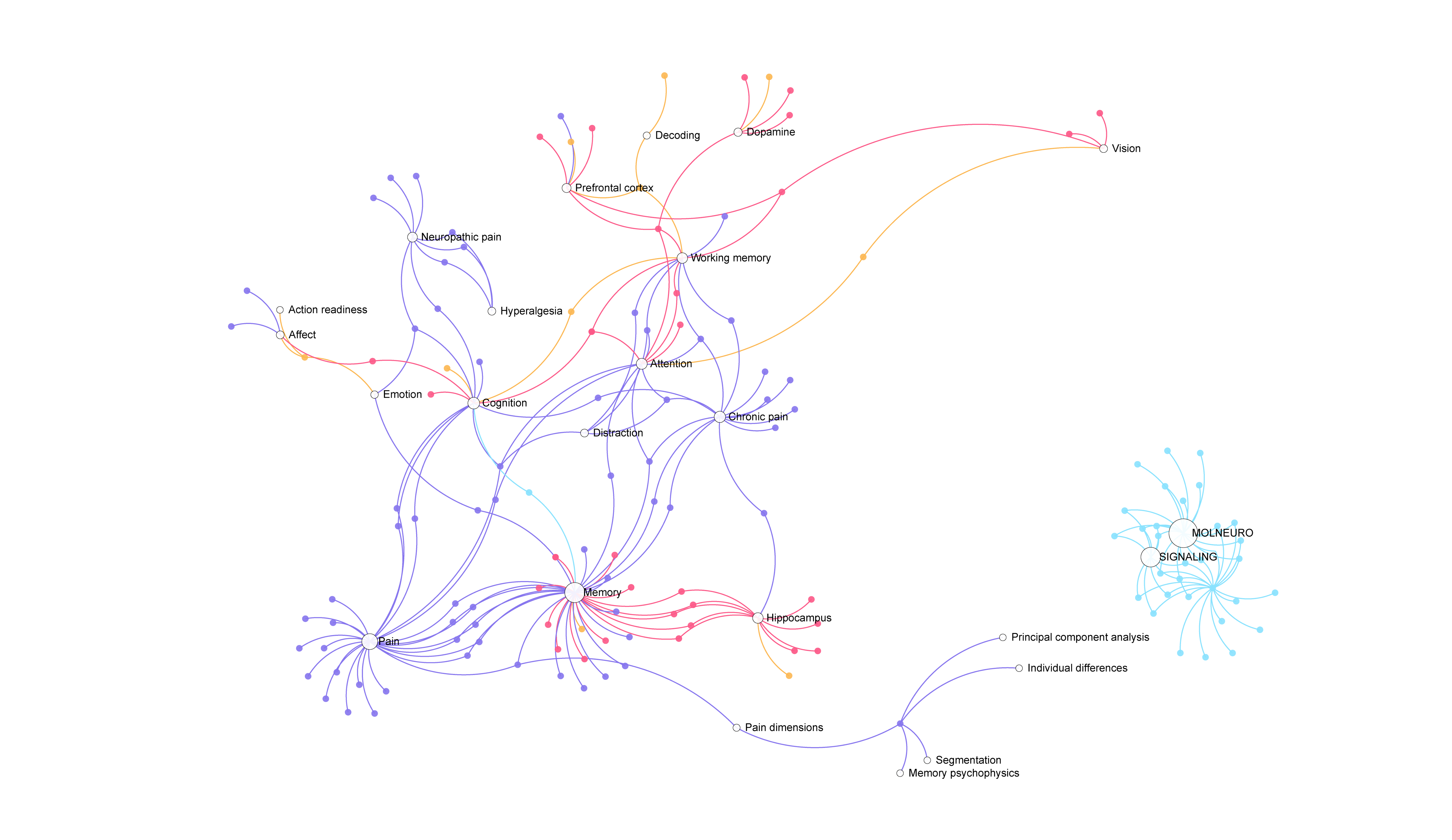
1. Visualization of neuroscience publication data from top neuroscience journals: Keyword Network
2. Visualization of neuroscience-related social media postings on twitter
CONCEPT
The publications visualization seeks to communicate the intricacies of the network of neuroscientists, which includes relationships between researchers, laboratories, and the actual content they produce. The tool would allow academics and other interested parties to navigate research artifacts in ways more revealing than a standard database, uncovering not just the papers they are looking for, but hidden relationships they might not know are there.
The 3-dimensional visualization of publications was a first prototype at getting at exploring the variety of dimensions available in publication data. However, the network view uncovered more interesting relationships between papers and people than did the 3D view.
PROCESS: RESEARCH PUBLICATIONS
To render this prototype, we worked with Scopus, a journal database containing abstracts and citations for thousands of scientific publications. We conducted several data searches and created a visualization based on the search of keyword “memory.” In this basic trial, we narrowed our results to the top journals on the topic “memory” within the field of “neuroscience.”
In the 3D view, we could start to view the data in terms of its multiple dimensions. Not only can we experience the way that the publication output increases over time, but also we can shift and see this same set of data -- thousands of publications -- organized by their citation rate in the Y axis and using time as the grounding X axis dimension.
However, more interestingly, the network view calls out keyword relations between papers, something that can be lost in the myriad of papers written and in the frenzy of citation counts in searches. Sometimes, the most "important" papers are those that are cited quite infrequently, but that contain unusual and unique discoveries. How to get at this aspect of the data? It will require more prototypes, but the keywords can be a way of moving towards this goal.
TECHNICAL PROCESS: RESEARCH PUBLICATIONS
Three-dimensions and data:
It was a new challenge to create a visualization of data that could exist in three dimensions (we used the three.js library) but could also be manipulated with d3 functions such as transitions and data mapping.
Nodes and network:
We created several functions to process the publication keywords, filtering them down to find the major keywords based on a threshold of occurrence, and then setting those major keywords as the targets for any nodes that have one (or more) of those keywords.
PROCESS: SOCIAL MEDIA PUBLICATIONS
Here, our goal is to display the latest brain-related blurbs from popular news outlets and social media. It is meant to reflect the importance of public opinion at the Zuckerman Institute.
In order to create a prototype that hints at these concepts, we scraped twitter for tweets on "neuroscience" for approximately 12 hours. We then created a visualization that first organizes each tweet into a concordance view, and then disperses them, allowing them to rejoin one another in a network according to whether they have one of the dataset's major keywords. Finally, they ribbon out again, as a way to allow the networks to shine and the individual words to flit away over time.
The audience for this would be passersby, who might have a moment to glance over, but would need a pop of information as opposed to being able to spend time perusing and interacting with a visualization (as they would for the research publications visualization).
TECHNICAL PROCESS: SOCIAL MEDIA
We created several functions to filter the incoming tweets for curse words or other bad language, as the display is meant to be for the public.
We also found the major keywords by going through the whole list of tweets, distilling them down to only "interesting" words (not "and, a," etc.), and then, out of those, choosing the words with top occurrence.
Links
Network
Github repo: 3d
Github repo: network
Github repo: tweets
Role:
Researcher, designer, developer.
Collaborators:
3D: Dan Taeyoung Lee
Concept and Neuroscience Expertise: Caitlin Shure
Project Manager:
Jochen Hartmann
Directors:
Laura Kurgan, Mark Hansen
Software:
Javascript/d3, html/css