Annelie Berner
Projects
Courses
Talks & Workshops
Annelie Berner —
Annelie Berner is a
designer, researcher, teacher and artist specialised in data
visualisation.

Visualising Research
Over the course of several research projects, I have implemented a tool to visualise the interconnections and patterns that emerge from collected knowledge. The interface has been used to represent a range of focuses depending on the client. Initially built to represent the field of neuroscience publications, we repurposed it to convey the links between life-centred researchers, and again used it to map out the field artificial intelligence ethics.
We have used it to communicate, share and explore research that might otherwise stay strapped in databases or spreadsheets, shared and understood only by an individual or private group.

In the case of the life-centred map, the client could see leaders on life-centred design from around the world, shift their focus towards non-Western thinkers.
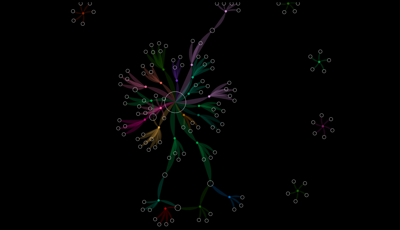 In the case of the AI ethics map, the client could see who and what topics dominate the field. That map stimulated a new project designing tools to represent individuals otherwise on the fringe of the AI ethics field.
Date: 2015, 2019
Role: Designer, developer
Technologies: d3.js