Annelie Berner
Projects
Courses
Talks & Workshops
Annelie Berner —
Annelie Berner is a
designer, researcher, teacher and artist specialised in data
visualisation.

Radials
We see the newspaper every day, but what is the machine of editing and publishing that runs beneath it? While working in the New York Times' Research and Development Lab, I developed a set of visuals based on data from the publication patterns for the paper. Each full radial represents a day of online publication. Each line represents an article, its length shows the relative word count, its color is the section, its placement in the circle is according to what time of day it was published (on a 24 hour clock).
After several interviews with various experts on the publication's history and patterns over time, I began to design different takes on one day of metadata.
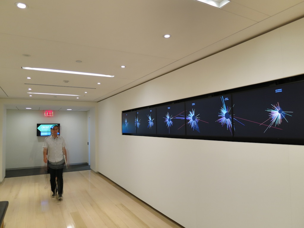 Using Processing, I made a multi-screen experience as part of the Lab’s daily tours.
I built a website in d3.js to share the multi-screen experience in a stand-alone format. Viewers could consider and compare the differences from week to week and highlight sections or see all articles published at once.

Finally, I created a working prototype of a web-based visualization using Javascript and d3. This version takes in data about the NYT blogs as well and allows viewers to toggle between blogs / all publication to see the difference in publishing patterns with the digital changes in media.
 It also allows viewers to scroll over each article/line, seeing the headline for that specific article and section.
 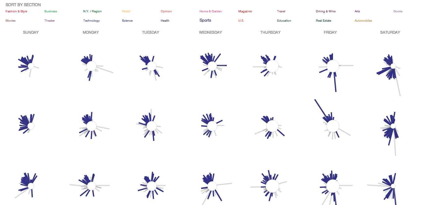 Viewers can highlight by section if they are interested in the different patterns of section publication throughout the week.
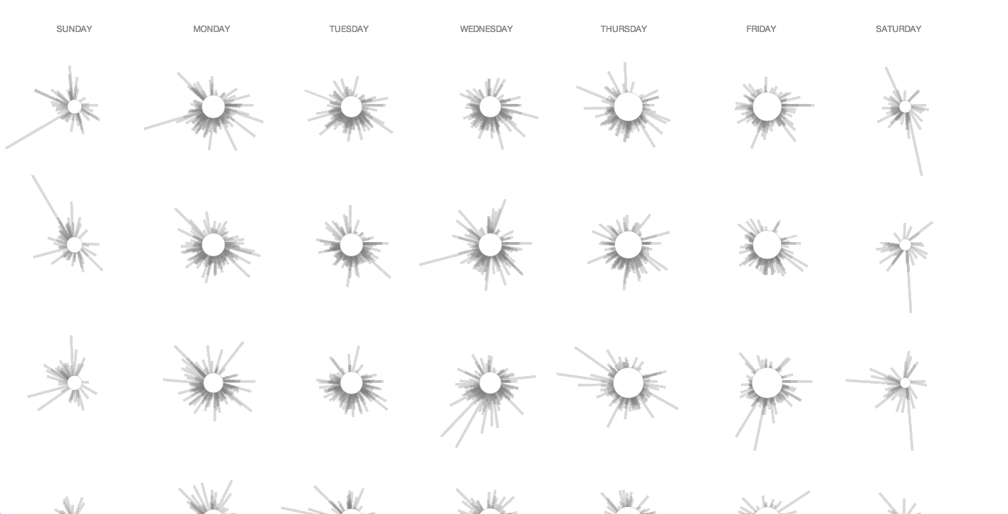 Here we see how heavy the blog publication is throughout the day, as opposed to only print - which is always very light in the 1 a.m. - 4 a.m. section of the clock.
Date: 2013
Role: Visual designer, interactive designer, developer
Technologies: Processing, Javascript, d3
Collaborator: Alexis Lloyd
Location: NYT Research & Development Lab